Project Manager: Sarah Longwill Designers: Marina Prates and Michelle Barnes Photographer: KRUG Studios Food stylist: David Grenier
Award: 2018 American Package Design Awards
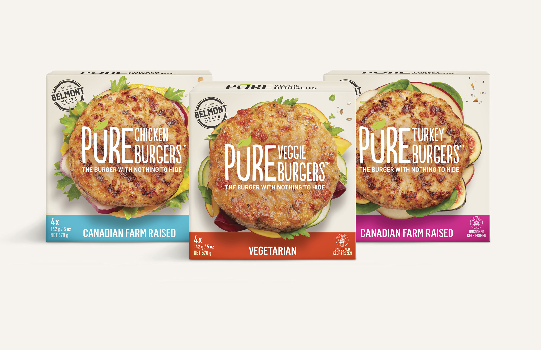
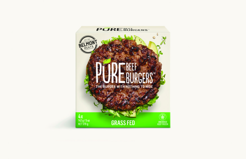
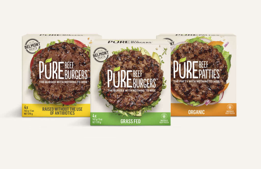
In a world of frozen burgers, every package design seems to highlight the same thing: the bun, not the burger! For over 50 years, Belmont Meats has produced frozen burgers for various brands. For the first time, they came to the market with something completely their own.
Belmont wanted to appeal to the millennial market, which has a different mindset on what “frozen burger” means. They want convenience, but they also want healthier options. The trouble is, the frozen burger market is saturated and the shelves in the grocer’s freezer section are full. These better-for-you burgers needed to stand out and differentiate – and do it from five feet away behind a foggy freezer door.
Key to the brand identity was the name, and it doesn’t get any simpler than Pure Burgers. This name informed the look and feel of the packaging: simple and bold. Just a single statement tells you what makes this burger great – there’s no complicated clutter. A bright and friendly colour palette differentiates the line from a sea of neutrals. While each burger’s dressing was carefully considered against results of extensive research into consumer preferences, it was placed underneath, leaving the focus on what matters most: the burger itself. Finally, to further enhance the taste appeal, gloss and emboss treatments were used on the burger’s package, leaving the rest of the package remained matte.